The place to reconnect with self and others.
Yoga Dreams is a boutique yoga studio, offering an exceptional space for practitioners seeking an inviting atmosphere, quality classes, and a place where connections can form.
Our collaboration took place before the studio’s opening to establish a visual identity that builds recognition from day one.
Avoid clichés, stay original.
Creating a brand identity for a yoga studio is quite a challenge these days if you want to remain recognizable while avoiding clichés.
If you know, you know: lotus petals, meditating silhouettes, typography bent into cobra pose – all tinted with chakra colors.
Therefore, our process began with in-depth differentiation research to avoid similarity with other studios and filter out clichés before any concepts were created.
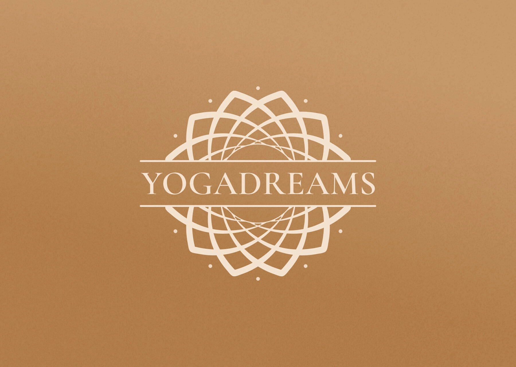
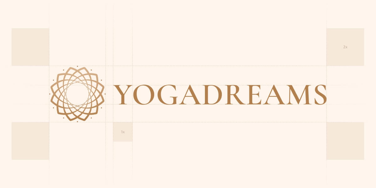
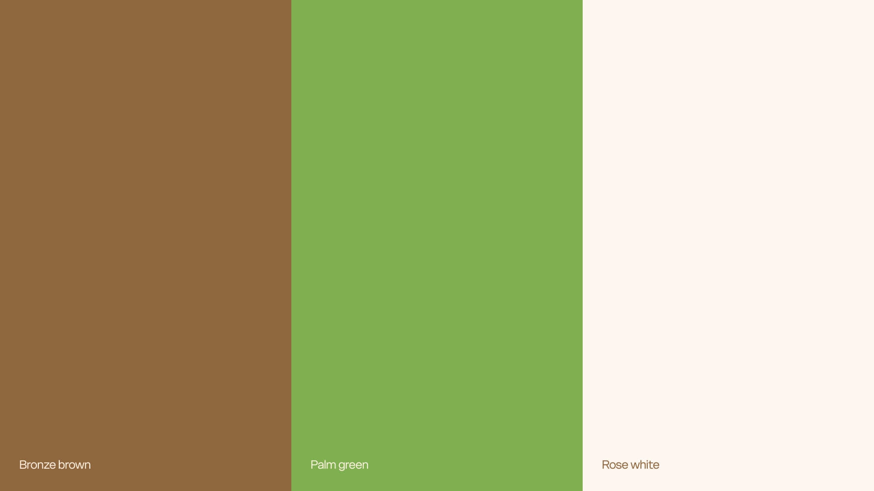
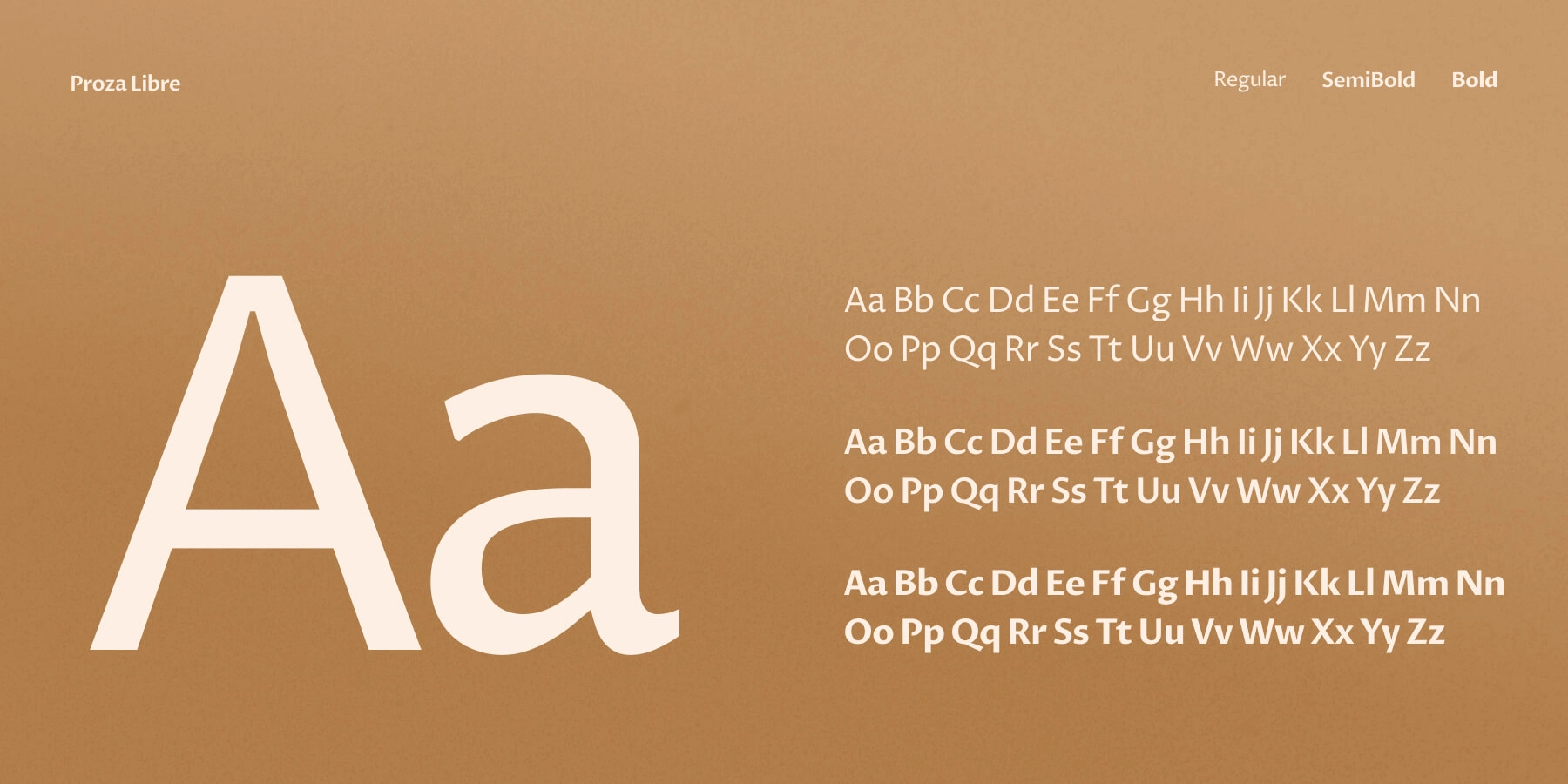
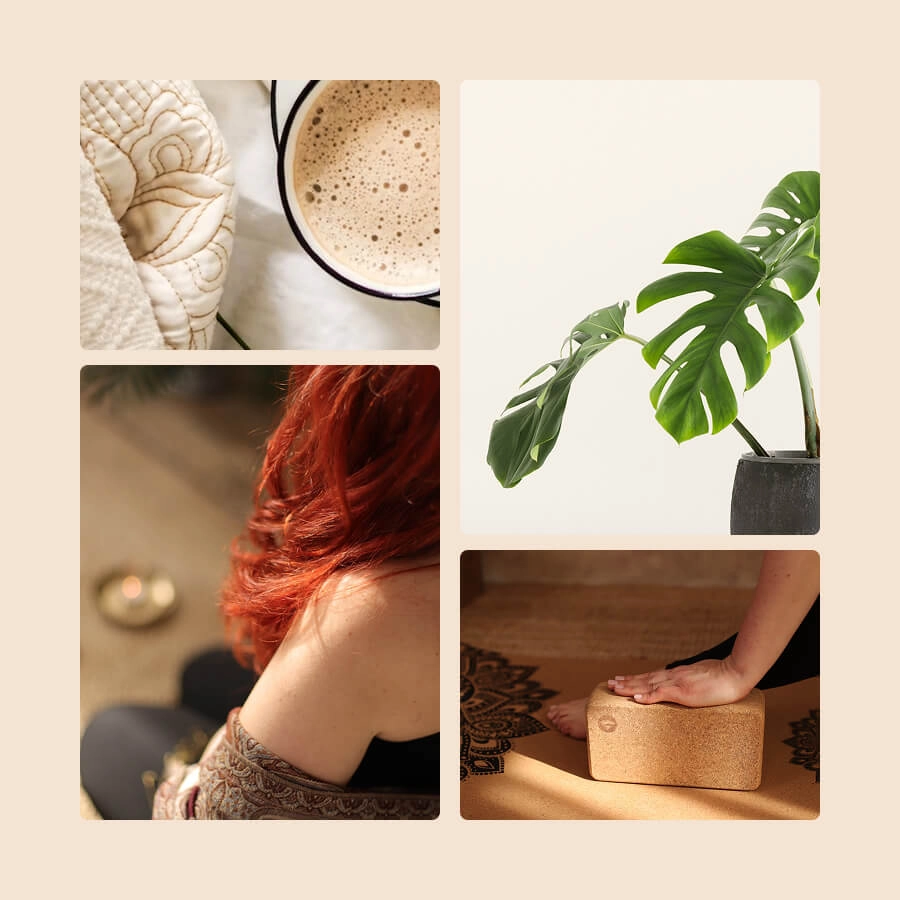
The visual identity was developed with specific aspects in mind: an inviting atmosphere conveying a sense of sophistication and care.
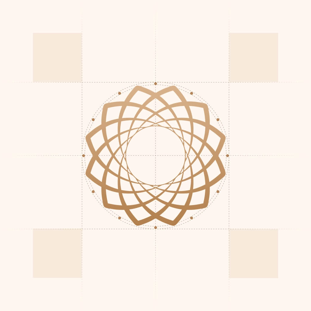
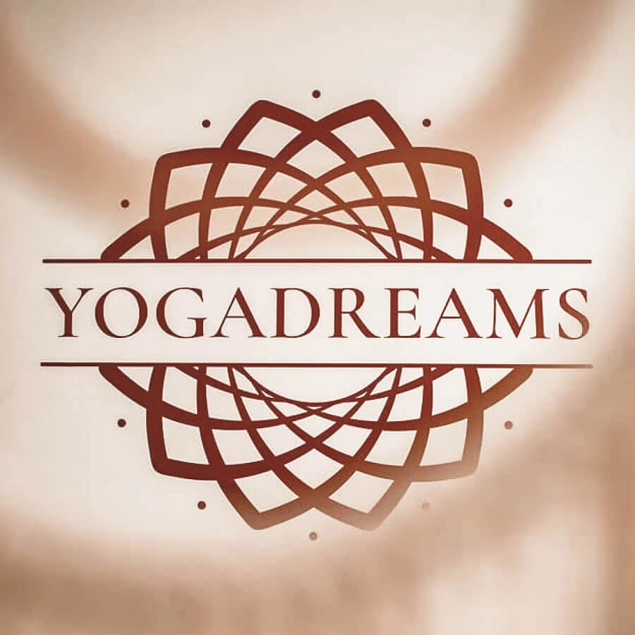
To keep the logo “yoga-relatable” at first sight, we stayed close to well-known symbols like the lotus and mandala but approached them in an unexpected way.
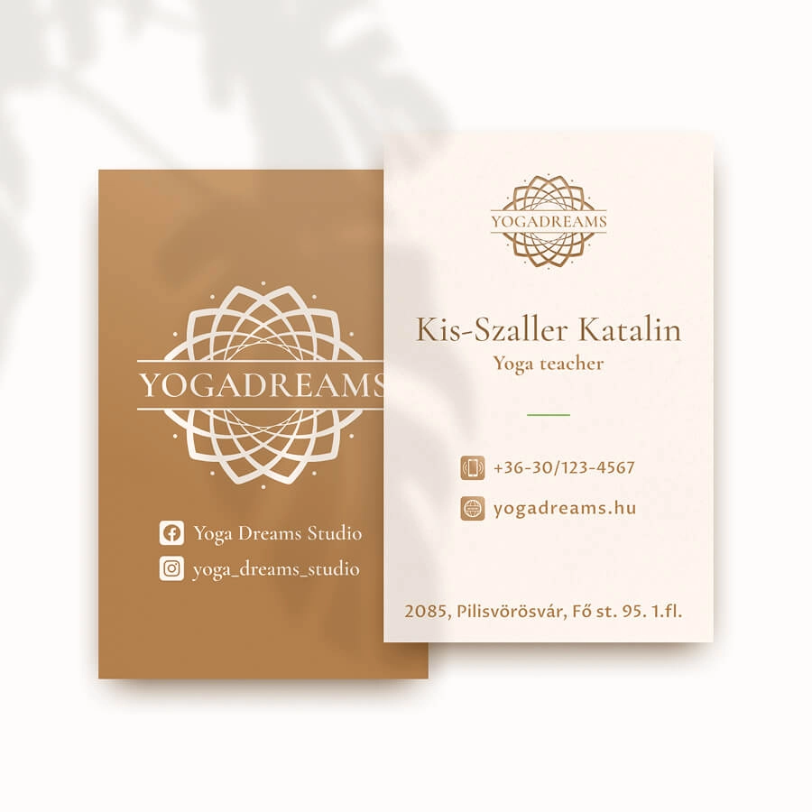
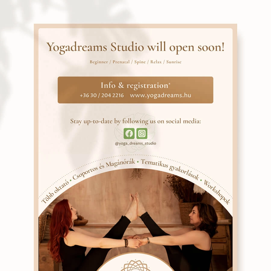
Materials for promotion
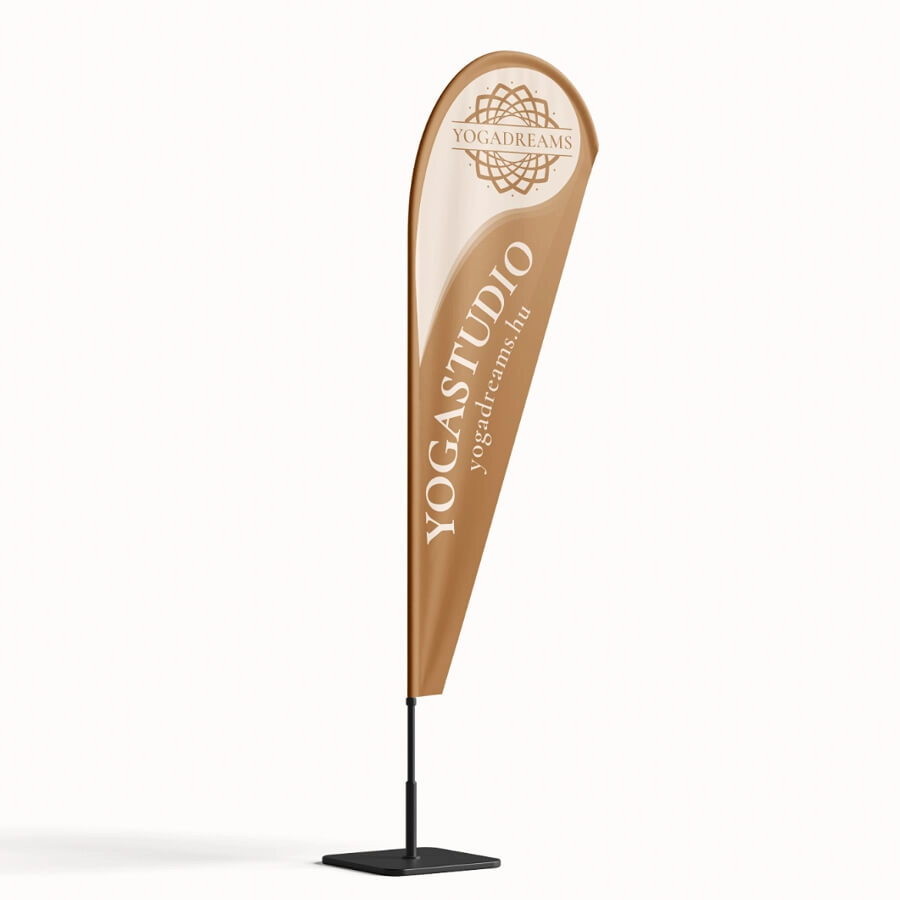
Taking the first steps in marketing required collaterals that are physically present in the studio’s local area. For this reason, several print materials were designed.
IG templates
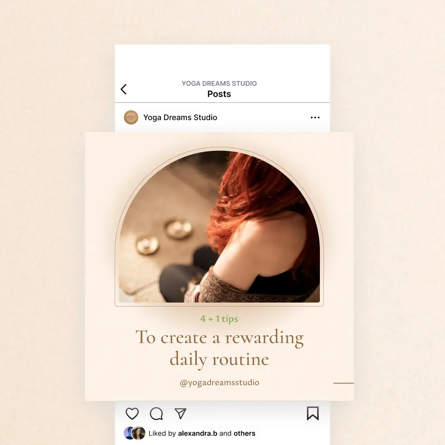
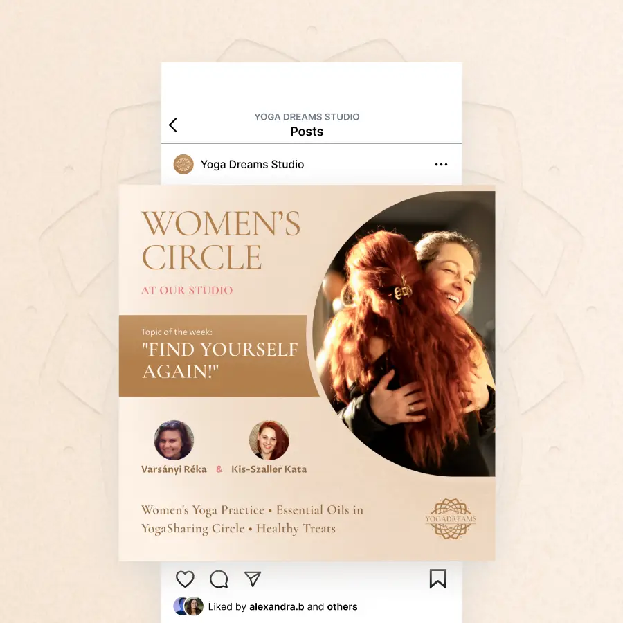
A special request was to develop Instagram post designs that even a non-designer can easily manage in the long run. This was fulfilled by building templates in Canva, supported by one-on-one training.
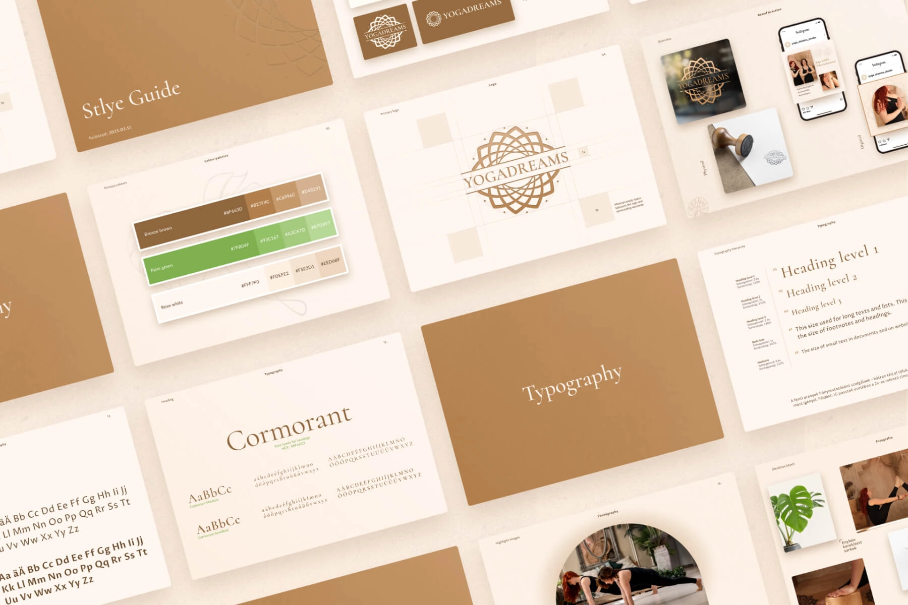
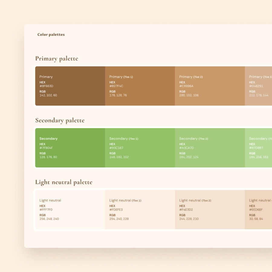
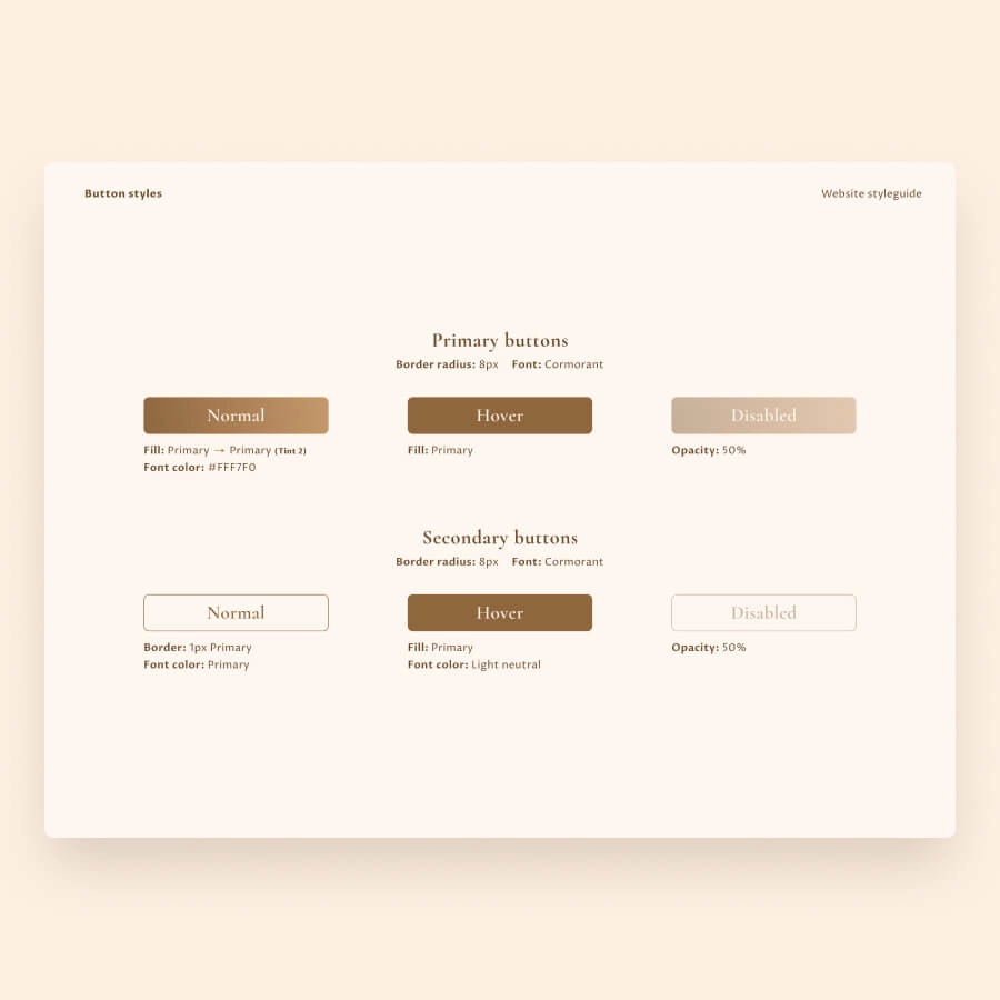
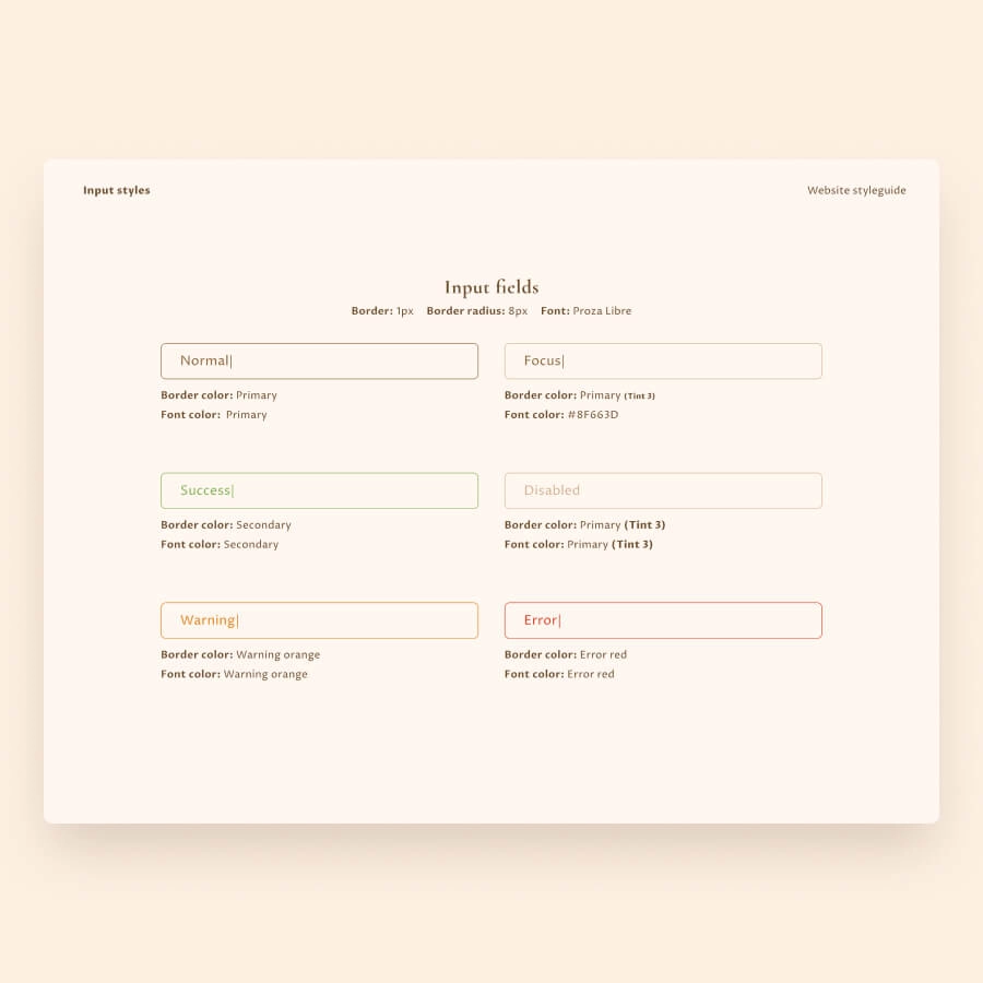
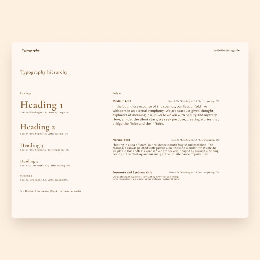
Guideline for brand coherent website.
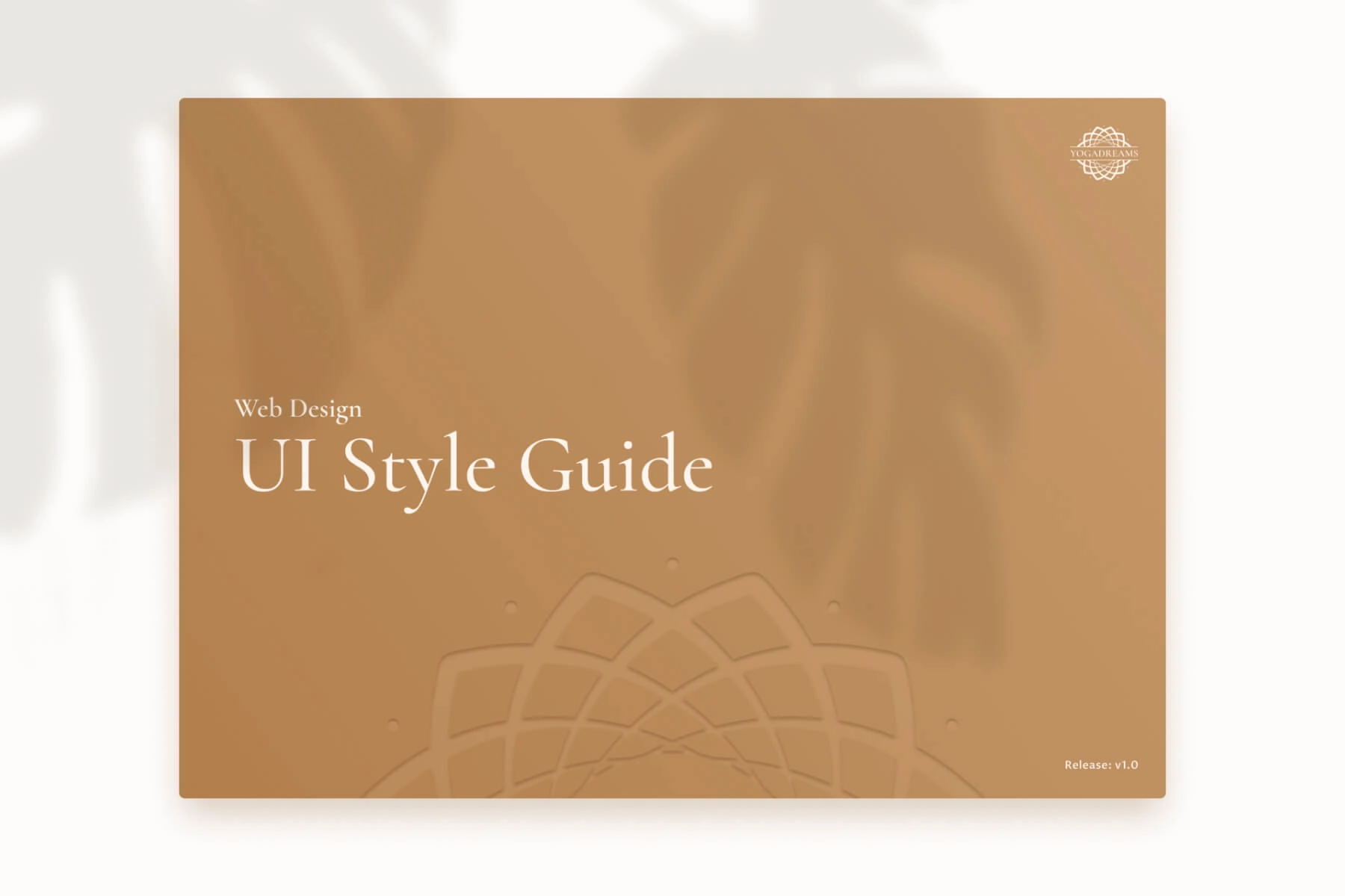
To support website development and ensure the design remains true to the brand, I developed a guideline covering all the essential styling rules – written in the language of a developer.
Honestly, I am very satisfied. He completely grasped the atmosphere and created a brand identity that represents the quality our practicioners receive from us.”

Feeling inspired by the story of Yoga Dreams?
Tell me about your vision, or let’s explore together what would support your goals.