

Styling harmonious interiors without the fuss.
Niké is a seasoned professional, designing refined interiors that truly feels like home. After years in the practice, her target audience and service model reached a point of significant change.
Amidst this change, we began collaborating to establish a new brand identity that speaks for her ideal clients, and a website that reflects the simplicity of her renewed services.
From bold contrast to refined serenity.
Niké arrived with a clear vision: her services had evolved, and the brand needed to transition from a minimal aesthetic towards a more sophisticated, curated presence. Our collaboration focused on realigning her brand with a discerning audience that values understated elegance and lasting quality.

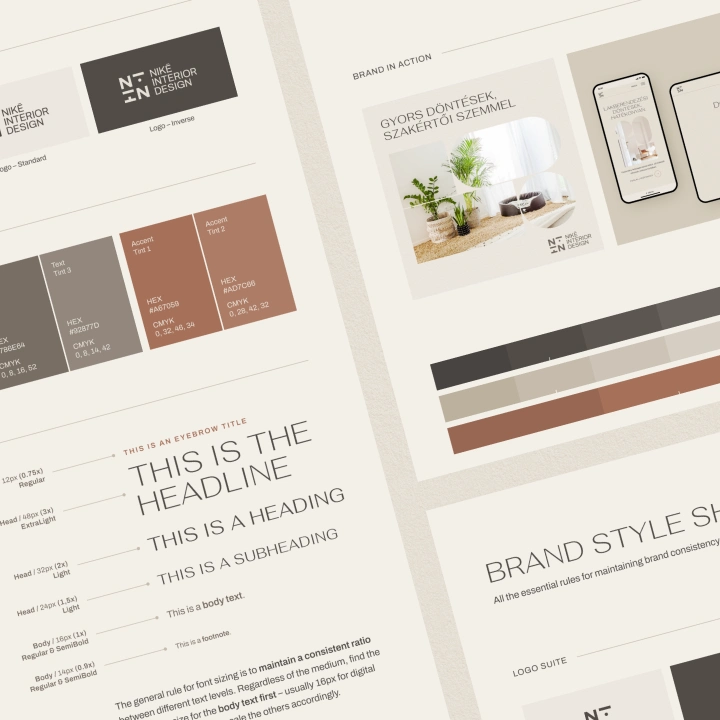
Repositioning NiiN required thorough research and consideration to shape a distinctive identity that remains relatable to interior design yet stands out with authenticity.
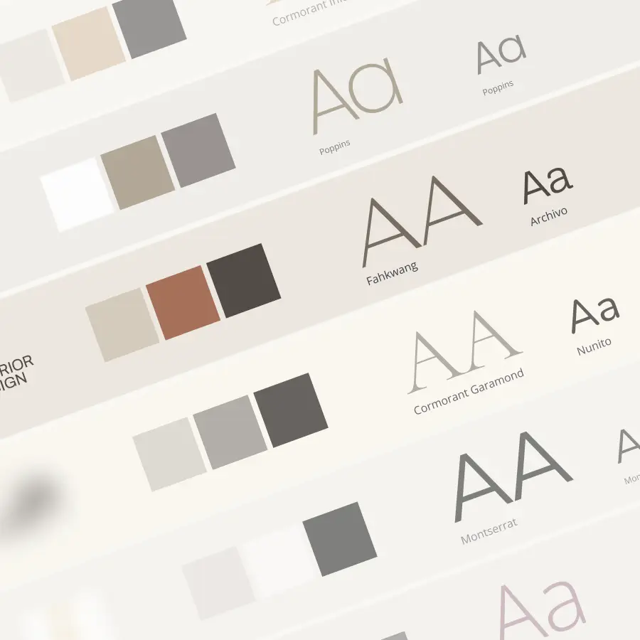
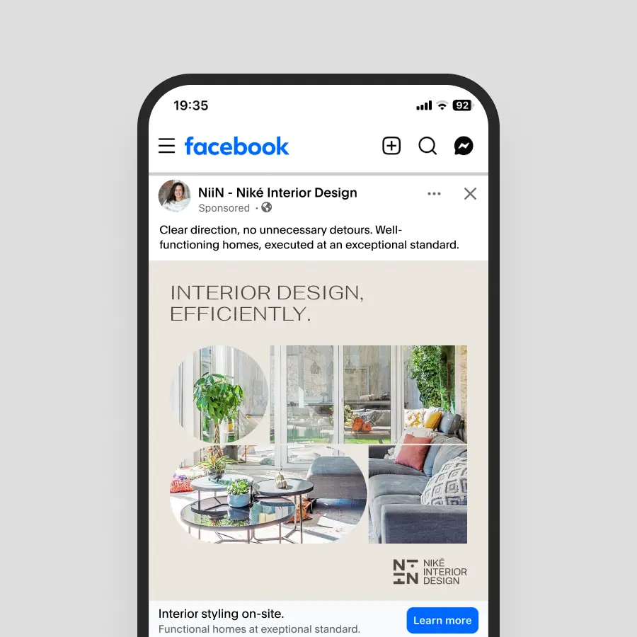
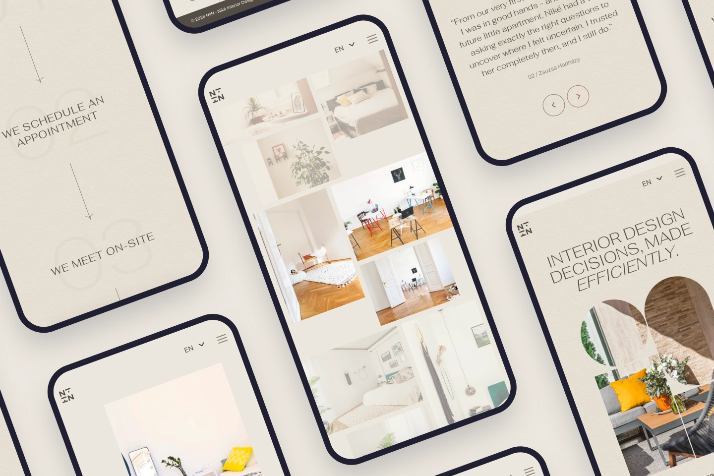
We moved away from the bold black-and-white look to embrace a warm, organic palette. By introducing soft beiges and refined textures, we created an atmosphere of welcoming premium.

Sales page with noble simplicity.
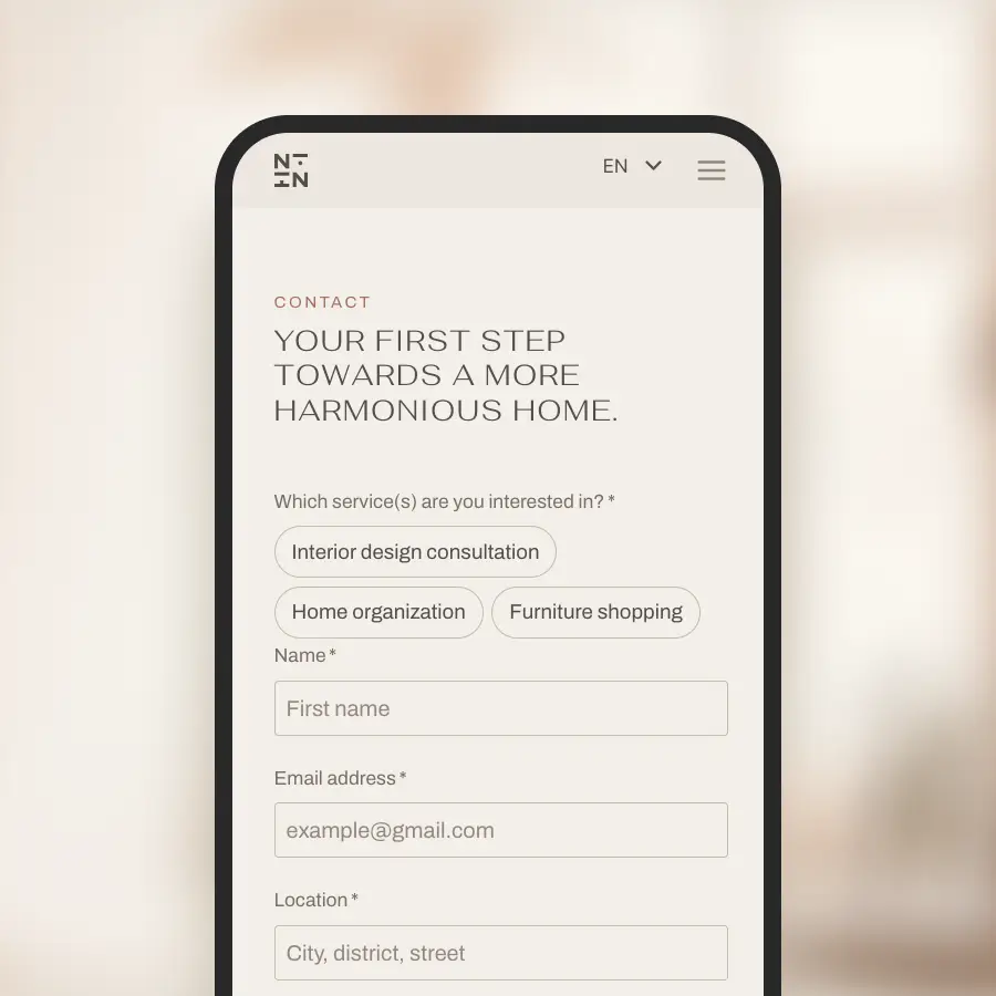
Our goal was to replace complexity with clarity and efficiency. Every design choice was made to guide the audience toward a single, transparent conversion goal, radiating the brand’s value immediately, without unnecessary detours.
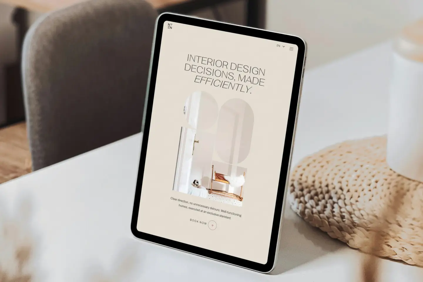
Transitioning from a traditional multi-page site, we built a focused, single-page experience that respects the visitor’s time and attention.
We went full wabi-sabi by stripping away the noise, delivering only the most essential information through a clean, intentional flow.


Polishing the narrative into a continuous flow.
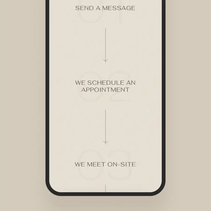
Although Niké brought exceptionally well-prepared website copy, the real magic happened when we placed it into context by visualizing it within low-fidelity mobile wireframes.
We moved away from fragmented sections and conventional labels like “About” and transformed the content into a continuous, narrative-driven dialogue.
Working with Koppány has been one of the best professional collaborations I’ve had. From day one, our communication was seamless, the process was well-structured, and every step stayed perfectly on schedule.
I wanted to elevate my business with a stronger brand identity and website that not only looks refined, but is also easy to manage in the long-term. He understood my vision immediately, and his guidance and strategic suggestions were incredibly valuable.
Together, we created an online presence that represents my business on a much higher level and gives potential clients a far more professional and credible impression. The result is a brand and website I genuinely feel proud to build on moving forward.

Feeling inspired by NiiN’s transformation?
Tell me about your vision, or let’s explore together what would support your goals.
